Website development for business: how to avoid mistakes

What are the typical mistakes they make when developing websites for business and how to avoid them by making the website as convenient and enjoyable as possible for visitors.
Let’s be realistic about our capabilities. Today, it’s possible to create a beautiful website if you use the right tools – and you don’t even need to know how to write code. But this is not enough for the site to be 100% effective.
The lack of a professional approach is a really big problem because for the health of the business you need a carefully thought out and perfectly optimized website. It helps to attract customers, increase conversions and build your brand.
Unfortunately, as on the first date, beginners have many chances to spoil everything.
Typical mistakes when developing a website for business
The good news: making an effective website is still easier than rehabilitating after the first date. Below we list the most serious mistakes that a small business makes when creating websites. Avoid these traps, and you will approach the hearts of users, turning them into loyal customers.
Lack of responsive design
This is the most serious mistake of beginners. What is a responsive website?
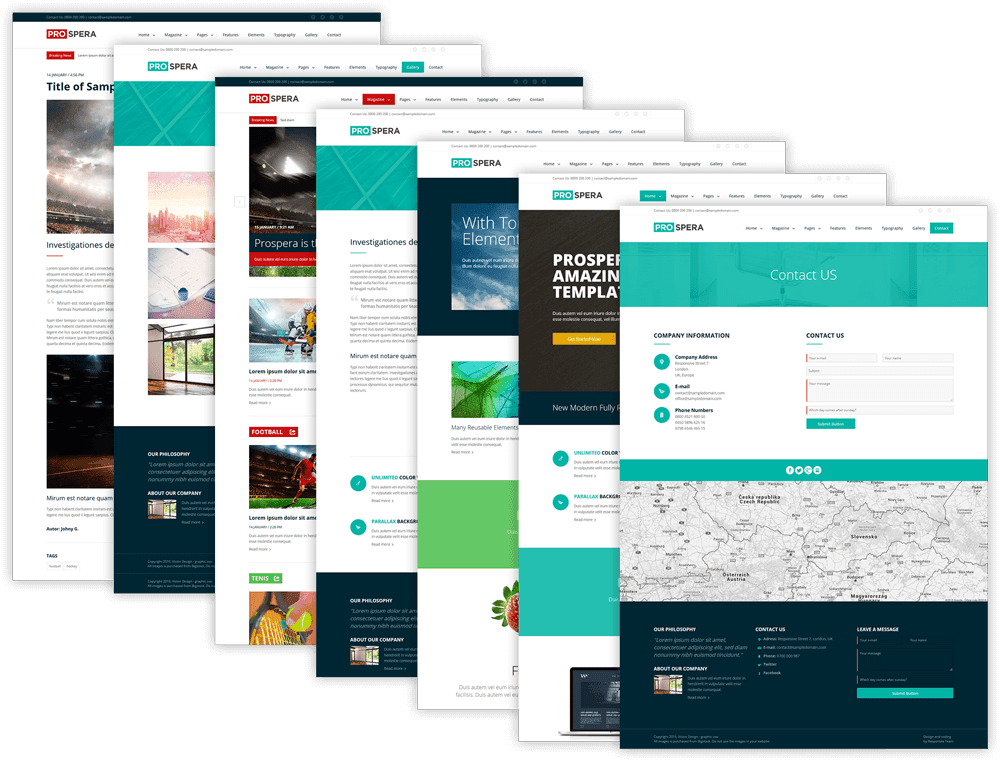
In a nutshell, it is a site that is sensitive to external factors in order to provide the user with the best possible browsing experience. If a user accesses your site from a smartphone with a small screen, the page layout will be displayed in a different way than when visiting through a computer with a 24-inch monitor.
We took a closer look at the statistics surrounding the use of responsive design. Here’s a simple fact: 61% of users after a negative experience of viewing a site on mobile no longer return. At the same time, 40% will immediately start looking for competitors’ websites.
By negative experience, respondents mean any, including minor problems with the display of content, including distorted display of buttons, text, etc.
The implications for business don’t end there. If you don’t build a mobile-friendly website, Google will pay attention to visitor dissatisfaction and a high bounce rate. As a result, your site will fall in the SERPs.
Conclusion: when ordering a website for business, pay special attention to the display of pages on mobile devices. This is a key factor that will affect your reputation.
Template theme for the site
One of the best features of using a modern content management system is the numerous free and near-free themes that you have at your fingertips. So great is the temptation to take and download one of them, saving money and time.
But experts strongly advise to personalize the theme according to the style of your brand. Otherwise, you’ll end up with a website that looks like two drops of water similar to thousands of other business projects – a big mistake.

The designer will draw unique icons, logos or other own images for you, place menu items where they work best. As a result, personalized design will pay off with satisfied customers more than once.
Conclusion: entrust the design of the site to professionals if you want to stand out from the crowd.
Use of slang words
So, you are engaged in the provision of financial services to individuals. The order of the day is that you know a bunch of specific terms and use professional jargon. You don’t need to decipher words like “doha” or “signaca,” but users of your site may not understand them.
If a visitor goes to a business website that seems to be aimed at his beloved, and the content turns out to be full of professional slang, most will be upset and will not deal with your metaphors. They will turn around and go looking for another source of valuable information, and you will be left without money.
Remember: the average person has a shorter attention span than a goldfish. That’s just 8 seconds in which you need to explain everything and convince him to stay.
This means that when customers find your site, they should be greeted with clear content that encourages them to act quickly – whether it’s watching a video, signing up for the subscription process, or subscribing to an email newsletter.
Let me give you some simple tips:
- title: direct, clear, without complex terms and jargon;
- subtitle: a summary of the service and benefits in one sentence;
- call to action: clear, convincing and, preferably, clickable.
When approaching copywriting and design, follow these simple tips and people will respond with gratitude. Your goal is not to express, but to win over ordinary users.
Unreadable content
Not only should the text on the site be pleasant and simple, it should also be easy to see. Allow users to quickly and easily re-read it, understanding the essence.
When you order the development of a website for a business or use a website builder, you have the right to do the project at your discretion. Yes, even in small yellow letters on a black background! But it is not a fact that it will work.
There are years of practice. What you can do and what you can’t do. Professionals understand them and know them by heart. So that the design does not spoil the impression of the site, it is worth observing several established rules.

First, stick to a consistent font size. Capital letters are the best way to draw the reader’s attention and convey important information. Smaller font sizes should be used for more information.
When creating a website, do not mix many different sizes on one page, stick to 3-4 sizes. This is quite enough for perception.
Second, choose the appropriate font types. Papyrus’ cute calligraphic font may look cute at your child’s birthday, but for a business website, it’s out of place in most cases. Therefore, use the services of a designer who will select fonts and check them for readability and aesthetics.
One important point: sans-serif fonts - those that do not have extra dashes around the edges - are usually more readable and easier for users to perceive on the pages of sites.
Finally, choose contrasting colors. When choosing the color palette of the site, make sure that the background images do not drown out your font. Readability should be a priority.
Let’s summarize the main techniques to increase readability:
- the text is simple, clear and does not contain slang;
- colors are perfectly combined, and no image distracts from the text;
- important points are highlighted in large print, and details are highlighted in small print.
As practice shows, the readability of the site brings money.
Myths about search engine optimization
Every new business owner hopes to create a website that will take the top line of search results on Google, Yandex and any other search engine. They hope to get to the top of a few keywords with the first page.
The truth is that a successful SEO strategy takes time, experience, and money. In addition, it is impossible to optimize your homepage for hundreds of keywords. Search works very differently, and if you also try to cut corners with forbidden tricks, remember – Google knows where you live.
The best strategy is to think about the main keyword for your website and optimize the content to get to the top of that keyword. Here are a few suggestions.
First, write long and useful publications. Once upon a time, filling out useless articles with a bunch of keys allowed you to take a place in the search results. Gone are the days, and just like on a first date, you’ll be punished for being too hasty.
These days, it’s better to just write content for the user. You have to be obsessed in a good way to publish quality and inspired articles. Search engines reward those who are most useful to the audience.
Second, clearly structure your content with title tags from <h1> to <h6>. Unfortunately, they are often perceived as something secondary, and for this the entrepreneur can pay. Titles provide the structure of your pages, making it easier for readers and Google’s search engine crawlers to use the content.
Third, use a call to action (CTA). The home page of a business website simply must have a bright call to action. Not only will this help your readers do what you want them to do – buy your product or sign up for a newsletter – it will also help search engines better understand your goals.
Pop-ups
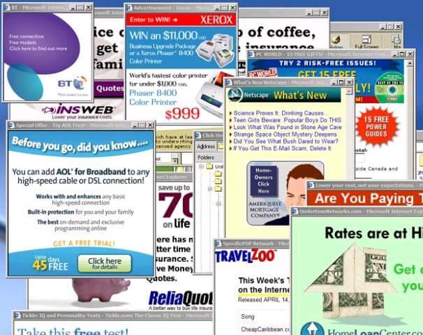
Attention, the question is: Do you want a long-term interaction with users? If the answer is yes, then the worst thing you can do for your website is to fill it with annoying pop-ups.

When someone puts a sign in front of your face, it’s hard not to pay attention. But if you put a bunch of such signs in front of the site visitor, you can discourage him from any desire to return. Pop-ups are appropriate for a narrow range of projects, but in most cases they bring only negativity.
Useful pop-ups that serve your readers can be a great way to build a business online. For example, you can include a single pop-up asking the user to do one of the following: join a mailing list, share a post, follow you on social media, or sign up for an upcoming event.
But when it is followed by other windows that require a person to do more and more…
The result is logical: the visitor leaves.
When it comes to pop-ups, be wise. Determine which most important action you want from your users, and then create a pop-up window around that action. Leave the rest alone.
We advise you to follow the examples of industry leaders:
- No more than one pop-up window
- the window contains only important and useful information;
- The window quickly disappears when the user enters data or refuses.
- the user does not have to perform multiple actions.
Feel free to use a pop-up window, but stick to the measure. A person should look for goods and services without feeling at a noisy rally among banners.
Slow loading of the site
Did you know that, according to a study by Akamai Technologies, users are only willing to wait four seconds for a site to load before leaving the site? This means that if you do not take care of speed, you will lose a significant percentage of customers.
A few simple things to improve your download speed:
- Reduce the volume of web pages that load.
- compress images as much as possible and remove unnecessary graphics;
- Minimize browser requests.
- Optimize CSS and JavaScript code.
- cache static files;
- use CDN, etc.
Website development for business on 1C-Bitrix allows you to optimize the speed of loading web pages with the help of the latest tools, such as Content Delivery Network. This is guaranteed to improve behavioral factors, and also contributes to increasing the position of the site in search engines.
Poor navigation
Internet users enter nearly 7,000,000,000 requests daily, and websites with intuitive navigation get more visitors. On such sites, people linger longer, which serves as a positive signal for search engines.
If you’re not able to help users get what they want immediately, chances are they’ll go to a competitor’s site. Here are some recommendations on how to make the design intuitive for users.
First, consult a professional web designer. Yes, perhaps you have been nurturing your vision of the site for a long time, but the specialist knows more about the behavior of users and will save you from typical mistakes. This is very important!
Once you’ve agreed on a design that works with your brand, it remains to add quality content – and you have a well-designed, easy-to-use website.
Second, stick to certain standards. People are creatures of habit, so the established standards largely dictate our behavior. And most of us are used to expecting vertical navigation on the left side of the page and horizontal navigation at the top of the page. Don’t confuse the user.
Finally, don’t overload the pages. You may want to include a lot of useful links in the navigation bar. But remember: less is more. Products, services, contacts – post what users really need.
Outdated information or design
Many novice online entrepreneurs perceive a business website fundamentally wrong. They tend to think that it is enough to spend once, develop a beautiful design, order competent articles and that’s all: you can rest on your laurels and watch how evergreen content brings passive income.
As much as we’d like to, there’s nothing evergreen on the internet, and especially in the world of e-commerce. Your website requires regular updates and maintenance.
Fresh and up-to-date information helps customers – if you allow the outdated one to hang on your site, it will be difficult for users to find you, order from you and remain a regular customer. Anything that is out of date needs to be updated or removed!
The frequency of updating sites is also important for search engines. Google’s algorithms constantly analyze websites based on hundreds of criteria. A search engine tries to understand how fresh and reliable your website’s content is. Are new posts published? Maybe the company has long been closed and this site is no longer relevant?
As for modern design, it is necessary, first of all, to make a favorable impression on its visitors. Are you doing cosmetic repairs to your store, aren’t you? Refreshing the exterior? Changing worn-out commercial equipment?

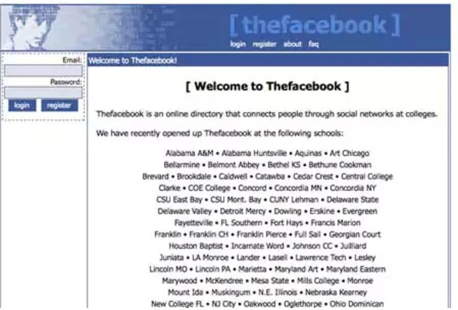
Here’s what Facebook, one of the most popular websites in the world, looked like when it first launched. Imagine how “successful” it would have become in 2022 if Zuckerberg had abandoned the appearance of the project. Yes, the picture is not impressive.
As you continue to build and grow your business, don’t abandon the site!
Tags
Share
About Me

Join our newsletter
Get business tips once a month
Legal Stuff
